Spearman’s \(ρ\) (rho)#
Spearman’s \(\rho\) is a non-parametric correlation measure. To be very specific, it measures the strength and direction of a monotonic relationship between two variables.
Monotonic means variables are consistently increasing or decreasing, but not necessarily at a constant rate.
Assumptions
Ordinal level data or higher.
Non-linear monotonic relationship.
You can also add to this that if you violate the assumptions necessary for Pearson’s r, that you can instead use Spearman’s \(\rho\). In particular, you have outliers that would distort Pearson’s r, or you cannot safely assume approximate normality.
So, why do we not need to assume linearity or approximate normality? It’s because Spearman’s \(\rho\) uses rank values of data and not the raw data. Ranked data means that you actually rank the values from 1st through nth place based on each data point’s raw value, and then you use all of the values in the Spearman’s \(\rho\) formula:
n is the number of paired variables
d is the difference in ranks of the paired variables
At this point you’re likely wondering: “What about if there’s tied ranks?”
Great question! In this scenario the calculation resorts to a more general formula that resembles that of the general form of Pearson’s r:
\(R_{x}\), \(R_{y}\) are the ranks of your two variables
\(cov(R_{x}, R_{y})\) is the covariance of the ranks
\(\sigma_{R_{x}}, \sigma_{R_{y}}\) is the standard deviation of the ranks
As you can see, when there are ties the formula is now a standardized measure of covariance of the ranks. Note that when you’re doing this in Python, pandas’ corr and scipy.stats.spearmanr will automatically choose the right formula for you.
How to Interpret
If you’ve read the Pearson’s r section, then you will see the interpretation is really similar.
Value Range |
Description |
|---|---|
\(\rho\) = 0 |
No correlation |
\(\rho\) = 1 |
Perfect correlation |
0 < \(\rho\) < 0.3 |
Weak positive correlation |
-0.3 < \(\rho\) < 0 |
Weak negative correlation |
0.3 \(\leq\) \(\rho\) < 0.7 |
Moderate positive correlation |
-0.7 < \(\rho\) \(\leq\) -0.3 |
Moderate negative correlation |
\(\rho\) \(\geq\) 0.7 |
Strong positive correlation |
\(\rho\) \(\leq\) -0.7 |
Strong negative correlation |
Python Code Example#
# Import
import numpy as np
import pandas as pd

# Correlation coefficient
import scipy.stats as stats

# Visualizations
import matplotlib.pyplot as plt
import seaborn as sns
# Load Planets dataset from Seaborn - drop missing variables
planets = sns.load_dataset('planets').dropna()
df = pd.DataFrame(planets)

# View some details
df.head()
| method | number | orbital_period | mass | distance | year | |
|---|---|---|---|---|---|---|
| 0 | Radial Velocity | 1 | 269.300 | 7.10 | 77.40 | 2006 |
| 1 | Radial Velocity | 1 | 874.774 | 2.21 | 56.95 | 2008 |
| 2 | Radial Velocity | 1 | 763.000 | 2.60 | 19.84 | 2011 |
| 3 | Radial Velocity | 1 | 326.030 | 19.40 | 110.62 | 2007 |
| 4 | Radial Velocity | 1 | 516.220 | 10.50 | 119.47 | 2009 |
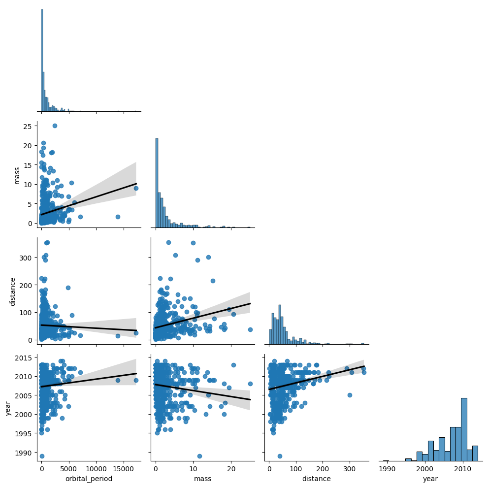
To start, let’s investigate the distributions of each variable both statistically and visually.
# Check skew and kurtosis
pd.DataFrame(data={'skew': df.iloc[:, 2:6].skew(), 'kurtosis': df.iloc[:, 2:6].kurtosis()}).style.background_gradient(cmap='coolwarm')
| skew | kurtosis | |
|---|---|---|
| orbital_period | 5.292769 | 45.491120 |
| mass | 2.590085 | 7.962541 |
| distance | 2.795719 | 11.529675 |
| year | -0.847536 | 0.235389 |
Ignoring year, the other 3 variables have fairly strong skew and kurtosis values. Based on this you can justify using Spearman’s \(\rho\), but let’s visualize their distributions to see how bad it is.
# Seaborn pair plot
sns.pairplot(df.iloc[:, 2:6], corner=True, kind='reg', plot_kws={'line_kws': {'color': 'black'}})

plt.tight_layout()
plt.show()
### Individual calculations of Spearman's rho - excluding number, year
for col in df.iloc[:, 2:5].columns:
  # Exclude orbital_period
  if col != 'orbital_period':
    # Calculate Spearman's rho
    r, p = stats.spearmanr(df['orbital_period'], df[col])
    # Output display
    print(f'Spearman\'s rho between Orbital Period and {col}: {round(r,2)} | p-value: {p}')
    print('Positive relationship \n' if r > 0 else 'Negative relationship \n')
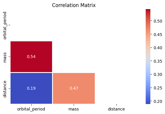
Spearman's rho between Orbital Period and mass: 0.54 | p-value: 1.6395198723487584e-39
Positive relationship

Spearman's rho between Orbital Period and distance: 0.19 | p-value: 2.4062719749387224e-05
Positive relationship
# Show the matrix
df.iloc[:, 2:5].corr(method='spearman').style.background_gradient(cmap='coolwarm')
| orbital_period | mass | distance | |
|---|---|---|---|
| orbital_period | 1.000000 | 0.542858 | 0.188038 |
| mass | 0.542858 | 1.000000 | 0.467621 |
| distance | 0.188038 | 0.467621 | 1.000000 |
This is a small set of variables, but I will still show the Seaborn heatmap method.
# Visualize the matrix via Seaborn
planets_corr = df.iloc[:, 2:5].corr(method='spearman')

mask = np.triu(np.ones_like(planets_corr, dtype=bool))

plt.figure(figsize=(6,4))
sns.heatmap(planets_corr, mask=mask, annot=True, fmt='.2g', cmap='coolwarm', linewidths=1)
plt.title('Correlation Matrix')
plt.tight_layout()